import os
import pandas as pd
import geopandas as gpd

import rioxarray as rioxr
import matplotlib.pyplot as pltAnalysis of the Thomas Fire: Boundary, True/False Color Mapping and Air Quality Index
Using CalFire, Landsat, and US EPA data to map the scars and air quality changes from the 2017 Thomas fire.
Author: Michelle Yiv
For further information and content about this analysis, view this GitHub repository.
This blog at a glance:
Purpose
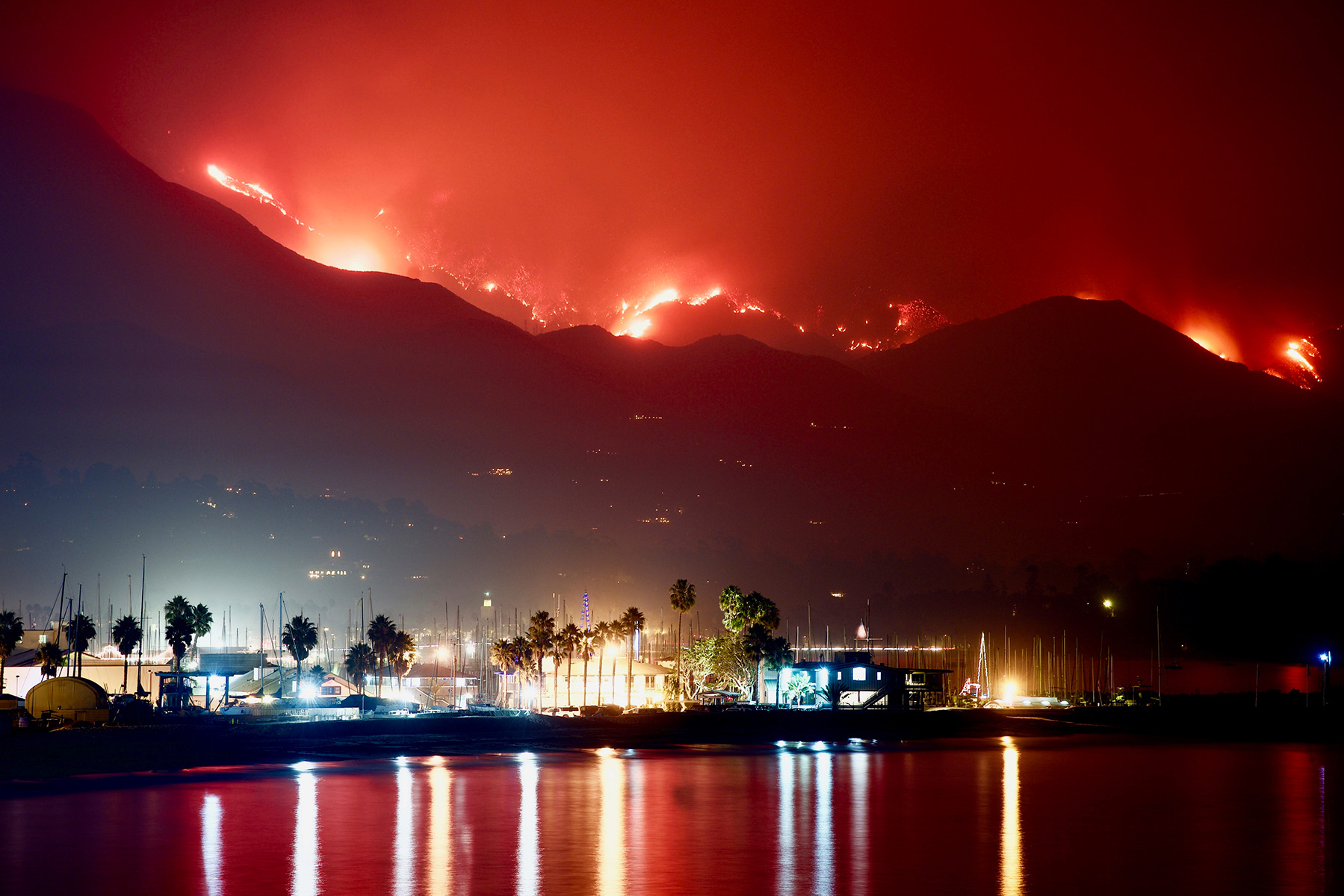
The Thomas Fire burned 281,000 acres in Santa Barbara and Ventura County from December 4th, 2017 to January 12, 2018. Approximately 1063 structures were consumed by the fire, and 2 people lost their lives. It is currently the 10th largest wildfire in California.
We are visualizing the burn scars and air quality impact from the 2017 Thomas Fire in Santa Barbara.
Landsat data was used to visualize the Santa Barbara area and was combined with Thomas Fire data to map the fire’s boundary. True and false color imagery was used to visualize burn scars, and air quality index data is used to further visualize the impact from the fire.
Datasets used
1. California Fire Perimeter
California fire perimeter was published by CAL FIRE and contains information about fires in California. In addition to the geometries (perimeters) of each fire, there is information about the name, date, and acres burned.
2. Landsat data
Landsat was published by Microsoft Planetary Computer and contains both x,y coordinates and variables containing spectral bands (R, G, B, NIR, SWIR) for plotting. This dataset contains the Santa Barbara location and surrounding areas.
3. Air Quality data
Air quality data was published by the US Environmental Protection Agency and contains information about AQI values and its corresponding health concern category.
Analysis Highlights
Plotting true and false color imagery of the Thomas fire. It’s important to understand which bands to select to generate the respective images, and how false color emphasizes burn scars more than the true color. Packages used include ‘rioxarray’ to read in and utilize geospatial raster data.
Cleaning the Air quality dataset by standardizing column names and dropping unnecessary columns. Although this may seem basic, emphasizing tidy data is important for future processing.
Calculating a 5 day rolling average and plotting air quality index values. A rolling average is important because it de-emphasizes noise and brief fluctuations, allowing for clearer identification of trends. Packages used include ‘pandas’ to read in, tidy, and process data.
References to datasets
California Fire Perimeter. Date of access: 11-19-2024. Link to data Citation: “Data.gov,” Data.gov, 2024. https://catalog.data.gov/dataset/california-fire-perimeters-all-b3436 (accessed Nov. 19, 2024).
Landsat Data. Date of access: 11-19-2024. Link to data Citation: “Microsoft Planetary Computer,” Microsoft.com, 2024. https://planetarycomputer.microsoft.com/dataset/landsat-c2-l2 (accessed Nov. 19, 2024).
Air Quality Index Data Date of Access: 10-29-2024 Link to data Citation: “AQI Basics,” airnow.gov, 2021. https://www.airnow.gov/aqi/aqi-basics/ (accesed Oct. 29, 2024)
A guide to this blog
I thought that I would include a general guide to how I will be structuring this blog analysis. Since we are working with multiple datasets, I will break this up into sections and gradually introduce the datasets.
I will start by loading all packages here to follow good coding practices.
Initial setup for all datasets
Load packages
Retrieving the boundary of the 2017 Thomas Fire
Let’s start by getting the Thomas Fire boundary data. I manually downloaded boundary data of all fires in California, placed it into my data folder, and read it in using an absolute file path and the GeoPandas package because it is a shapefile. I saved this data to a new variable named ‘fire’.
fp = os.path.join('data', 'California_Fire_Perimeters_(all).shp')
fire = gpd.read_file(fp)
However, we only want the boundary from the 2017 Thomas fire. Therefore, I filtered by both name and year because there have been multiple Thomas Fires. I saved this filtered data to a new variable named ‘thomas_fire’. To check if the data was filtered properly, I made an initial plot.
# Select 2017 Thomas Fire boundary by name and year
thomas_fire = fire[(fire['FIRE_NAME']=='THOMAS') & (fire['YEAR_']==2017)]

# Verify changes visually
thomas_fire.plot()_files/figure-html/cell-4-output-1.png)
It worked! We will come back to this boundary later to add to our maps in the next section.
True and False Color Imagery of the Thomas Fire
Let’s load in our data for our color imagery now. This data was sourced by the course instructor and is housed on the Bren School server. I accessed it by creating an absolute file path and reading it in using the rioxarray package because we are now working with geospatial raster data.
# Create filepath to import landsat data
fp = os.path.join('/',
                  'courses',
                  'EDS220',
                  'data',
                  'hwk4_landsat_data',
                  'landsat8-2018-01-26-sb-simplified.nc')
landsat = rioxr.open_rasterio(fp)
Let’s see what our data looks like:
landsat<xarray.Dataset> Size: 25MB
Dimensions: (band: 1, x: 870, y: 731)
Coordinates:
* band (band) int64 8B 1
* x (x) float64 7kB 1.213e+05 1.216e+05 ... 3.557e+05 3.559e+05
* y (y) float64 6kB 3.952e+06 3.952e+06 ... 3.756e+06 3.755e+06
spatial_ref int64 8B 0
Data variables:
red (band, y, x) float64 5MB ...
green (band, y, x) float64 5MB ...
blue (band, y, x) float64 5MB ...
nir08 (band, y, x) float64 5MB ...
swir22 (band, y, x) float64 5MB ...Our data comes out as an xarray.Dataset, with its dimensions (y, x, band) and variables containing our spectral bands for plotting. We’ve read in and verified our data, so now let’s do something with it.
Notice how we only have a single band. We want to drop this because we don’t need that extra dimension. We do this using squeeze() as seen here, and to remove the variable we use drop_vars(). It’s aptly named!
landsat = landsat.squeeze().drop_vars('band')True color image
Let’s start with a true color image: We will select red, green, and blue colors to make an image you would see out in the real world.
landsat[['red', 'green', 'blue']].to_array().plot.imshow(robust = True)_files/figure-html/cell-8-output-1.png)
Aside from how it floats in space, it looks great, right? Now, how did we actually plot this? Using our raster data, we select for red, green, and blue as indicated by the double brackets. We method chain into to_array(), which converts the data to a xarray.DataArray. This can then be plotted using .plot.imshow(), which is used for plotting 2D scalar data.
What is this robust=True parameter? Let’s see how it looks when we omit it.
landsat[['red', 'green', 'blue']].to_array().plot.imshow()Clipping input data to the valid range for imshow with RGB data ([0..1] for floats or [0..255] for integers)._files/figure-html/cell-9-output-2.png)
Scary, right! Clearly, we can see a difference from the previous plot, but we also get an warning message. What this robust parameter does is visualize the plot without RBG outliers from the clouds. Here, the other values are being so squished together that a plot like this is created.
False color image
Let’s transition to a false color image now. Wait, what? FALSE color? Look for yourself. Could you distinguish the burned area from the Thomas Fire? Me either, so this is why false color imagery exists. Using a combination of these selected colors can highlight features that may be overlooked on a true color image. So, we will follow a similar format for code as above, but we will simply use short wave infrared (swir22), near infrared (nir08), and red as our spectral bands instead.
# Make false color by plotting swir22, NIR, and red
landsat[['swir22', 'nir08', 'red']].to_array().plot.imshow(robust = True)_files/figure-html/cell-10-output-1.png)
It worked – the burn scars from the Thomas fire are visible now. In case you missed it, it is the red shaded portion located near Santa Barbara or at lower right portion of the plot. Now, I could be happy with this map, however I would like to use that boundary data we got earlier and map it on this plot.
Mapping Thomas Fire boundary onto false color image
Before we do anything, we must check the CRS since we want to plot two data sets on top of each other. Why is this important? Remember that a CRS, or a coordinate reference system, is using coordinates to represent places on earth. If they don’t match up, places will not line up and you will get errors when plotting.
Note how for our Landsat dataset, we use rio.crs instead of just .crs for our Thomas Fire boundary data. As a xarray.DataArray, to access its CRS we must do so through the rio accessor to access its raster properties.
As a side note, using f-strings are entirely optional. The most interesting thing from this is this <10, which dictates how many spaces are between both inputs.
print(f"{'Landsat CRS is':<10} {landsat.rio.crs}")
print(f"{'Fire CRS is':<10} {thomas_fire.crs}")
Landsat CRS is EPSG:32611
Fire CRS is EPSG:3857Clearly, these CRS do not match, and as we have learned this is a problem. There is an easy fix to this! Let’s use the rio accessor again and reproject our landsat data to our Thomas Fire Boundary data. Let’s also use an assert statement to ensure changes were made. Remember, if no error pops up, you are (most likely) good to go!
# Convert CRS of landsat to thomas_fire
landsat = landsat.rio.reproject("EPSG:3857")

# Verify CRS match
assert landsat.rio.crs == thomas_fire.crs
Yay! Now we can start mapping! Or can we? Remember how our plot was floating in space? We can actually clip our landsat data to our area of interest – The Thomas Fire boundary.
Let’s start by assigning this to a new variable called ‘landsat_fire’. From here, we want to access our data via the rio accessor, and then use clip_box() to clip our raster to the Thomas Fire boundary.
However, we can’t just input our Thomas Fire boundary by itself. First, we apply .total_bounds, which essentially creates a bounding box of the Thomas Fire boundary. To actually make this work, we need to use this *, or the unpacking operator, to apply the total_bounds to the minx, miny, maxx, maxy of clip_box()
landsat_fire = landsat.rio.clip_box(*thomas_fire.total_bounds)Finally we can make a comprehensive, clipped plot of the Thomas Fire!
Let’s go through this step by step:
- Initialize your plot by setting your figures and axes, along with your plt.show() at the very bottom.
- As our base map, let’s plot our false color map from above. The only difference is adding
ax=axin the.plot.imshow()parameter, to assign it to an axis of the plot - To add our thomas fire boundary, let’s use our first data set. Before we plot this, we add
.boundarywhich gives us the boundary instead of the entire shaded area as seen above. Again, we addax=axto add it to the same axis. I also changed to color and linewidth to make it stand out more. - To make things really clear, I added a legend for the Thomas Fire boundary using
matplotlibfunction. - Finally, I set a title using base plot notation.
# Initialize plot
fig, ax = plt.subplots(figsize = (8,8))

# Landsat clipped plot
landsat_fire[['swir22', 'nir08', 'red']].to_array().plot.imshow(ax = ax, robust = True)

# Thomas fire boundary
thomas_fire.boundary.plot(ax = ax,
                         color = 'red',
                         linewidth = 1.5,
                         label = 'Thomas Fire Boundary')
# Set legend location
ax.legend(loc='upper right')

# Set title
ax.set_title('False Color Map of 2017 Thomas Fire Scars')

plt.show()_files/figure-html/cell-14-output-1.png)
It looks great! Although there is still some black space, I like the clipped version a lot more. If you prefer viewing the whole plot, make sure you plot the original Landsat data, not the clipped version.
Air Quality Index analysis
Let’s move away from mapping and focus on air quality now.
As always, let’s load in our data. This is our last dataset for this analysis! These are simple CSV files, so we can use pandas.read_csv to read these in and assign them to variables.
We do have air quality indexes for 2017 and 2017 because the Thomas Fire ranged from December 4th to January 12. We will need to concatenate/stack our data for easier use using pandas.concat.
Let’s take a look at it and see what we are working with!
# Read in data
aqi_17 = pd.read_csv('data/daily_aqi_by_county_2017.csv')
aqi_18 = pd.read_csv('data/daily_aqi_by_county_2018.csv')

# Stack data frames into one
aqi = pd.concat([aqi_17, aqi_18])
aqi| State Name | county Name | State Code | County Code | Date | AQI | Category | Defining Parameter | Defining Site | Number of Sites Reporting | |
|---|---|---|---|---|---|---|---|---|---|---|
| 0 | Alabama | Baldwin | 1 | 3 | 2017-01-01 | 28 | Good | PM2.5 | 01-003-0010 | 1 |
| 1 | Alabama | Baldwin | 1 | 3 | 2017-01-04 | 29 | Good | PM2.5 | 01-003-0010 | 1 |
| 2 | Alabama | Baldwin | 1 | 3 | 2017-01-10 | 25 | Good | PM2.5 | 01-003-0010 | 1 |
| 3 | Alabama | Baldwin | 1 | 3 | 2017-01-13 | 40 | Good | PM2.5 | 01-003-0010 | 1 |
| 4 | Alabama | Baldwin | 1 | 3 | 2017-01-16 | 22 | Good | PM2.5 | 01-003-0010 | 1 |
| ... | ... | ... | ... | ... | ... | ... | ... | ... | ... | ... |
| 327536 | Wyoming | Weston | 56 | 45 | 2018-12-27 | 36 | Good | Ozone | 56-045-0003 | 1 |
| 327537 | Wyoming | Weston | 56 | 45 | 2018-12-28 | 35 | Good | Ozone | 56-045-0003 | 1 |
| 327538 | Wyoming | Weston | 56 | 45 | 2018-12-29 | 35 | Good | Ozone | 56-045-0003 | 1 |
| 327539 | Wyoming | Weston | 56 | 45 | 2018-12-30 | 31 | Good | Ozone | 56-045-0003 | 1 |
| 327540 | Wyoming | Weston | 56 | 45 | 2018-12-31 | 35 | Good | Ozone | 56-045-0003 | 1 |
654342 rows × 10 columns
Cleaning our data
This data goes against our tidy data rules, so we must fix it. At first glance, I notice inconsistent capitalization, spaces instead of underscores, and a need to filter to Santa Barbara County. Let’s start with our column names!
aqi.columns = (aqi.columns
                  .str.lower()
                  .str.replace(' ','_'))
We are reassinging the column changes back to the dataframe and using method chaining to make our changes. I started with str.lower(), which changes all column names to lower case. It may seem silly, but doing this now is better than constantly trying to remember what words were supposed to be capitalized. Finally, I used str.replace() to replace all the spaces with underscores. Again, this is just best coding practices and what we need to do if we want to actually have a good time using this data.
Now that our columns look a lot better, let’s filter our data to our county of interest. I did this using simple bracket filtering, keeping only county names that matched Santa Barbara. I reassigned this to a new variable as well.
Since we have our filtered data, we can drop unneccesary column that tie to location.
aqi_sb = aqi[aqi['county_name']=='Santa Barbara']

# Drop columns from data: State and county name and code
aqi_sb = aqi_sb.drop(columns=['state_name', 'county_name', 'state_code','county_code'])
Before I go any further, I want to check my column types. Look above to see the date column. If this is not in datetime format, I want to convert it since we will be doing time based rolling averages later. To do this, I use .dtypes to see data types by column
aqi_sb.dtypesdate object
aqi int64
category object
defining_parameter object
defining_site object
number_of_sites_reporting int64
dtype: objectAs I suspected, the date column is an object and needs to be converted. To do so, I will reassign the date column to itself, and use pd.to_datetime to convert it to datetime.
aqi_sb['date'] = pd.to_datetime(aqi_sb['date'])Rolling average and plot
We are finally finished cleaning our data! Now we can use our data without any worries.
Let’s start by calculating our 5 day rolling average. Why a rolling average? It minimizes noise and short term fluctuations, allowing us to visualize our trends better.
First, we have to set our index to the date column, so that when we use the .rolling() function, it can calculate from the date column. I created a new variable to assign the rolling average to, and subsetted our data to the ‘aqi’ column. Using .rolling().mean will calculate the rolling average for 5 days from the aqi column.
# Set index to date column
aqi_sb = aqi_sb.set_index('date')

# Calculate AQI rolling average over 5 days
rolling_average = aqi_sb['aqi'].rolling('5D').mean()

# Add rolling average as a new column
aqi_sb['five_day_average'] = rolling_average
Finally, let’s plot these values.
Let’s plot our filtered data, with both the rolling average AQI along with the reported AQI from the data. To make my plot presentable, I added a title, labels, and colors for each variable.
# Make plot of AQis by date

# Plot AQI
plt.plot( aqi_sb.aqi, color='lightblue', label='Daily')
plt.plot( aqi_sb.five_day_average, color='green', label='5 Day Average')
plt.title('Air Quality Index (AQI)\nDuring the 2017 Thomas Fire in Santa Barbara')

# Plot Customization
plt.legend()
plt.xlabel('Date')
plt.ylabel('AQI')

plt.show()_files/figure-html/cell-21-output-1.png)
Look at how different our rolling average is from the raw data! Clearly, the peak in late 2017 represents the Thomas Fire, and you can see the impact of the fire from how the peak towers over the others.
References
California Department of Forestry and Fire Protection. (2024). California Fire Perimeters [Dataset]. Data.gov. https://data.ca.gov/dataset/california-fire-perimeters-all. (accessed Nov. 19, 2024).
Microsoft Corporation. (2024). Landsat 8 and Sentinel-2 Surface Reflectance Data [Dataset]. Microsoft Planetary Computer. https://planetarycomputer.microsoft.com/dataset/landsat-c2-l2(accessed Nov. 19, 2024).
AirNow.(2024). Air Quality Index (AQI) Basics. [Dataset]. EPA.gov. https://www.airnow.gov/aqi/aqi-basics/. (accessed Oct. 29, 2024)
C. Galaz García, EDS 220 - Working with Environmental Datasets, Course Notes. 2024. [Online]. https://meds-eds-220.github.io/MEDS-eds-220-course/book/preface.html. Accessed 5 December 2024.